


Introduction
A high-converting landing page is the difference between a campaign that bleeds money and one that prints it. Your ad is running. Traffic is flowing. And yet…crickets. No signups, no sales, no conversions. Sound familiar? The problem isn’t your product. It’s your landing page. According to Unbounce, the average landing page conversion rate sits at 6.6%. The best ones hit 20%, 30%, even higher. This guide gives you everything you need to build landing pages that convert from structure to design, copywriting to optimization, and the tools that make it all possible.
Key Takeaways
- The average landing page conversion rate is 6.6% but optimized pages consistently outperform this benchmark.
- A high-converting landing page focuses on ONE goal, ONE audience, ONE action.
- Social proof, a strong value proposition, and a clear CTA are non-negotiable.
- Mobile optimization is critical over 60% of web traffic comes from mobile devices (Statista).
- A/B testing can improve your conversion rate by up to 30% (VWO).
1. What Is a High-Converting Landing Page?
Short answer: A high-converting landing page is a standalone web page designed to turn visitors into leads or customers by focusing on a single, specific action. Unlike a homepage which serves multiple audiences and goals a landing page that converts has laser focus. One message. One audience. One CTA.
📌 Citation Ready Block: A high-converting landing page is a dedicated page with a single goal: converting visitors into leads or buyers. It eliminates distractions and guides users toward one specific action.
The conversion rate of a landing page measures the percentage of visitors who complete that desired action whether that’s filling out a form, clicking a button, or making a purchase.
Why does it matter? Because sending paid traffic to a generic homepage is like pouring water into a leaking bucket. A properly built landing page stops the leak.
2. The Anatomy of a High-Converting Landing Page
Short answer: Every landing page that converts shares the same core structure a compelling headline, clear value proposition, trust signals, and a single CTA above the fold.
Here are the essential elements:
2.1 The Hero Section (Above the Fold)
This is prime real estate. Visitors decide within 3 seconds whether to stay or leave. Your hero section must contain:
- H1 Headline: Address the visitor’s core pain point directly.
- Subheadline: Expand on the promise with a specific benefit.
- Hero Shot: A product image, screenshot, or lifestyle photo that reinforces the value.
- Primary CTA Button: Visible without scrolling. Action-oriented. (“Start Free Trial”, “Get Instant Access”)
📌 Citation Ready Block: The hero section of a landing page must communicate your value proposition within 3 seconds. It includes a headline, subheadline, hero image, and one primary CTA all visible without scrolling.
2.2 Value Proposition
Every high-converting landing page starts with a compelling value proposition that immediately communicates why a visitor should choose your solution instead of a competitor’s. What makes your business different? What problem do you solve better than anyone else? A high-converting landing page answers these questions clearly and focuses on benefits rather than features. Take Slack as an example. Their landing page doesn’t describe the platform as simply a messaging tool. Instead, they position it as “where work happens.” That short statement instantly communicates the outcome users want, making it a powerful value proposition. The best high-converting landing page examples focus on the transformation customers achieve, not just the features they receive.
2.3 Social Proof
Social proof is one of the most powerful elements of a high-converting landing page because it reduces uncertainty and builds trust instantly. Trust signals convert skeptics. Include:
- Customer testimonials (with real names and photos)
- Case studies with measurable results
- Trust seals (SSL badges, payment icons, certifications)
- Number of customers served or reviews earned
Research from CXL shows that adding social proof elements can increase conversions by up to 34%.
2.4 Benefits Over Features
Visitors don’t buy features they buy outcomes. Instead of “24/7 customer support,” write “Get help the moment you need it, day or night.” Lead with what they gain, not what you built.
2.5 The CTA (Call to Action)
Your CTA is the heartbeat of your landing page. Rules for a high-converting CTA:
- Use action verbs: “Get”, “Start”, “Download”, “Join”
- Create urgency without being desperate: “Limited spots available”
- Make it visually distinct contrasting color, large button
- Repeat it 2-3 times across the page
3. High-Converting Landing Page Design Principles
Short answer: Great landing page design removes friction. It uses visual hierarchy, negative space, directional cues, and a mobile-first layout to guide visitors straight to the CTA. Design is not decoration. It’s persuasion in visual form.
3.1 Visual Hierarchy
Guide the eye. Use size, color, and placement to tell visitors: “Read this first, then this, then click here.” Your headline should be the largest element. Your CTA button should be the most visually striking.
3.2 Negative Space
White space isn’t wasted space. It’s breathing room that helps visitors focus on what matters. Cluttered pages confuse visitors. Confused visitors don’t convert.
3.3 Directional Cues
Arrows, eye gaze in photos, and visual lines all point visitors toward your CTA. A simple arrow beneath your headline pointing to a form can measurably increase form completion rates.
3.4 Responsive Landing Page Design
A high-converting landing page must deliver a seamless mobile experience since the majority of visitors now browse, engage, and convert from smartphones. Even small usability issues on mobile devices can significantly reduce conversion rates and increase bounce rates.
According to Statista, more than 60% of global web traffic comes from mobile devices. That’s why a high-converting mobile landing page should include:
• Single-column layouts
• Thumb-friendly CTA buttons
• Fast load times (under 3 seconds)
• Minimal form fields
📌 Citation Ready Block: Mobile optimization is non-negotiable for landing pages. With 60%+ of traffic coming from mobile devices, a responsive design with fast load times and thumb-friendly CTAs directly impacts your conversion rate.
→ conversion rate optimization guide
4. High-Converting Landing Page Copywriting That Sells
Short answer: High-converting landing page copy speaks directly to the reader’s pain points, uses benefits-oriented language, and guides them to act without tricks or fluff.
4.1 Write for One Person
Picture your ideal visitor. Write as if you’re having a conversation with them. Use “you” constantly. Address their fears, frustrations, and desires directly.
4.2 The AIDA Framework
Structure your copy using Attention → Interest → Desire → Action:
- Attention: Headline that stops the scroll
- Interest: Subheadline that deepens curiosity
- Desire: Benefits section that builds want
- Action: CTA that makes clicking feel obvious
4.3 Conversion Scent
Conversion scent means maintaining message consistency from your ad to your landing page. If your Google Ad says “Free Landing Page Template,” your landing page headline must echo that exact promise. A mismatch destroys trust instantly.
4.4 Handle Objections Proactively
Every visitor has doubts. Address them before they ask:
- “Is this secure?” → Show trust seals
- “Will this work for me?” → Show testimonials from similar customers
- “What if I don’t like it?” → Highlight your refund policy or free trial
📌 Citation Ready Block: Effective landing page copywriting addresses visitor objections before they arise, maintains conversion scent from ad to page, and uses benefits-oriented language focused on outcomes rather than features.
5. High-Converting Landing Page Examples by Industry
Short answer: The best-performing landing pages adapt their structure to their specific audience whether e-commerce, SaaS, real estate, or webinars.
SaaS Landing Pages: Dropbox built its growth on a landing page so simple it became a case study in every marketing school. The headline was clear, the demo video was front and center, and the CTA was impossible to miss. High-converting SaaS landing pages always lead with a free trial or premium offer.
E-commerce Landing Pages: High-converting e-commerce landing pages for product launches use countdown timers, limited stock indicators, and multiple product images from different angles. Urgency CTAs like “Only 3 left in stock” consistently outperform generic “Buy Now” buttons.
Real Estate Landing Pages: High-converting real estate landing pages focus on lead generation typically a form offering a free property valuation or neighborhood report. Short forms (name + email + phone) dramatically outperform long ones.
Webinar Landing Pages: High-converting webinar landing pages always feature the speaker’s credibility prominently, a specific date/time to create urgency, and a bullet-point list of exactly what attendees will learn.
6. Best Tools: Unbounce vs Leadpages vs HubSpot vs Instapage vs ClickFunnels
Short answer: The right landing page builder depends on your budget, technical skill level, and business objective.
| Tool | Best For | Starting Price | Key Feature |
|---|---|---|---|
| Unbounce | Marketers & agencies | $99/month | AI optimization, Smart Traffic |
| Leadpages | Small businesses | $49/month | High value, easy drag-and-drop |
| HubSpot | CRM integration | Free (limited) | Full marketing suite |
| Instapage | Enterprises & PPC | $199/month | Collaboration & personalization |
| ClickFunnels | Sales funnels | $97/month | Full funnel builder |
| Systeme.io | Beginners & affiliates | Free plan available | All-in-one affordability |
- Tight budget + beginners: Systeme.io or Leadpages
- Serious PPC campaigns: Unbounce with its Smart Traffic AI
- Full CRM ecosystem: HubSpot
- Complete sales funnels: ClickFunnels
📌 Citation Ready Block: Landing page builders like Unbounce, Leadpages, and Systeme.io offer drag-and-drop editors, A/B testing, and analytics to help marketers create high-converting landing pages without coding knowledge.
7. Common Mistakes That Kill Your Conversion Rate
Short answer: The most common landing page mistakes are too many CTAs, slow load times, mismatched messaging, and ignoring mobile users.
Here’s what to avoid:
- Multiple CTAs competing for attention — Pick ONE goal per page. Always.
- Slow page load speed — Studies consistently show that page speed improvements directly correlate with higher conversion rates. Use Google PageSpeed Insights to test yours.
- No social proof — Would you buy from a stranger with zero reviews? Neither will your visitors.
- Generic headlines — “Welcome to our website” is not a value proposition. It’s a conversion killer.
- Too many form fields — An e-commerce scenario: reducing form fields from 4 to 2 can increase form completion rates by 25% or more.
- Ignoring landing page KPIs — If you’re not tracking bounce rate, form abandonment rate, and conversion metrics in Google Analytics, you’re flying blind.
📌 Citation Ready Block: The biggest landing page mistake is having multiple competing CTAs. Every high-converting landing page has one primary goal, one primary CTA, and removes all distractions that could lead visitors away from that action.
8. How to Optimize a High-Converting Landing Page with A/B Testing
Continuous testing is what separates an average page from a truly high-converting landing page capable of generating consistent results over time.
Short answer: A/B testing compares two versions of a landing page element to determine which converts better, using real visitor data rather than assumptions. According to VWO, systematic A/B testing improves conversion rates by an average of 30%. Here’s how to do it right:
What to test first (in order of impact):
- Headline — The single highest-impact element on any page
- CTA button text — “Get Started” vs “Start My Free Trial”
- CTA button color — Contrasting colors typically outperform blending ones
- Hero image — Product shot vs lifestyle photo vs illustration
- Form length — Fewer fields almost always win
Rules for valid A/B tests:
- Test ONE element at a time
- Run tests for at least 2 weeks
- Aim for statistical significance (95%+ confidence)
- Use tools like Optimizely, VWO, or Google Optimize
Track Performance with Google Analytics
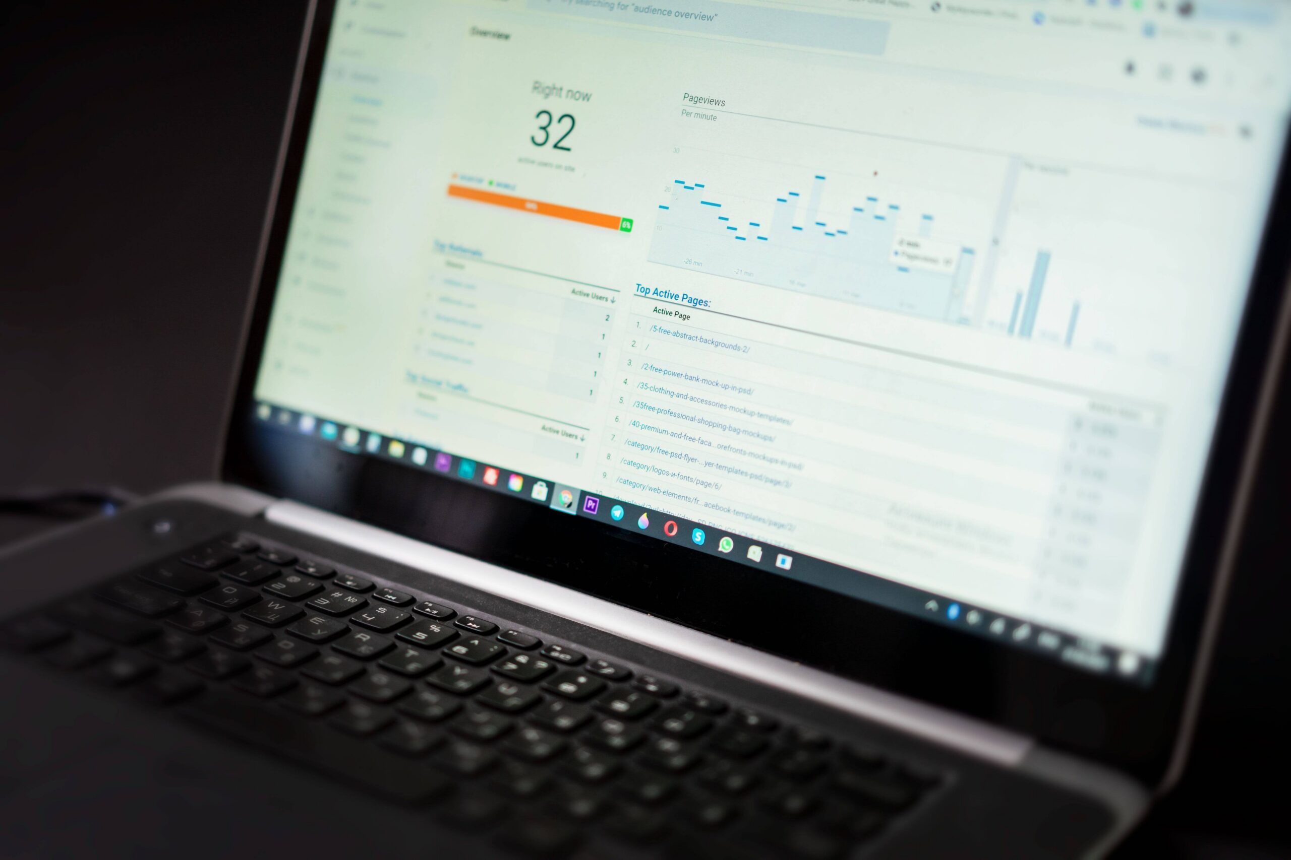
A high-converting landing page should always be connected to a reliable analytics platform. Google Analytics helps you track key performance indicators such as conversion rate, bounce rate, session duration, traffic sources, and form completion rates. By monitoring these metrics, you can identify bottlenecks in your conversion funnel and make data-driven optimization decisions instead of relying on assumptions.
📌 Citation Ready Block: Google Analytics enables marketers to measure landing page performance by tracking visitor behavior, traffic sources, conversion rates, and user engagement metrics.
For more advanced testing, multivariate testing lets you test multiple elements simultaneously but requires significantly higher traffic volumes to reach statistical significance.
9. High-Converting Mobile Landing Pages
Short answer: Mobile landing pages require simplified layouts, larger touch targets, faster load speeds, and CTAs positioned for thumb navigation.
With over 60% of traffic coming from mobile (Statista), a landing page that looks great on desktop but breaks on mobile is leaving conversions on the table.
Mobile optimization checklist:
- ✅ Single-column layout
- ✅ CTA button minimum 44×44 pixels (thumb-friendly)
- ✅ Page loads in under 3 seconds on 4G
- ✅ No intrusive popups on mobile
- ✅ Click-to-call button for phone-based businesses
- ✅ Forms with auto-fill enabled
- ✅ Images compressed without quality loss
Test your mobile landing page with Google’s Mobile-Friendly Test tool before launching any campaign.
✅ Checklist: 7 Steps to Build a Landing Page That Converts
Print this. Tape it to your screen. Use it every time.
- Step 1: Define ONE conversion goal for this page
- Step 2: Write a headline that directly addresses your visitor’s pain point
- Step 3: Build your value proposition around benefits, not features
- Step 4: Add social proof (testimonials, case studies, trust seals)
- Step 5: Place your CTA above the fold and repeat it 2-3 times
- Step 6: Optimize for mobile test on real devices, not just browser preview
- Step 7: Set up A/B testing and track your landing page KPIs in Google Analytics
📌 Conversion statistics evolve every year. To keep this article relevant, verify key figures (via Unbounce, WordStream, VWO) during your annual content update.
Conclusion
A high-converting landing page is never finished. The highest-performing marketers continuously analyze user behavior, test new ideas, and improve every element that impacts conversions.
Building a high-converting landing page isn’t rocket science but it does require intentional strategy. Every element on the page should serve one purpose: moving your visitor closer to that single conversion goal.
Start with a strong headline. Add social proof. Cut the clutter. Test everything.
The marketers who win aren’t the ones with the most creative designs. They’re the ones who test relentlessly, learn from real data, and optimize without ego.
Ready to build your first high-converting landing page? Start with one of the tools above and apply the 7-step checklist today.